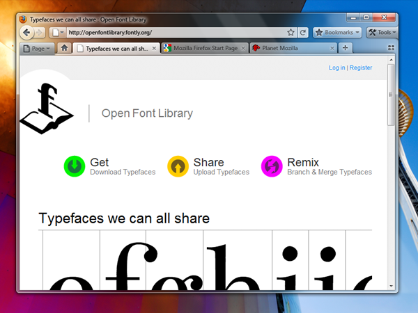
Something strange is happening over at Firefox I guess. It has not been long befor e they launched Firefox 3.5 and it’s update 3.5.1 and then there was news that Firefox 3.7 is due to be released. Today Firefox team released some screenshots of what they think Firefox 4.0 will look like but they claim that these screenshots are merely for brainstorming and getting useful feedback and the actual Firefox 4.0 may not look like this.
There is the new Glass Design that will adjust really well with Windows OS. And then there’s a debate on whether tabs should be on top or they should be at the bottom of the address bar. What’s your opinion? Take a look:
Positives
- Save Vertical Space
- Efficiency/Remove Visual Complexity - Right now the tabs have to be connected to something. So we are adding an extra visual element for them to connect to.
- Shorter Mouse Distance to Page Controls
Negatives
- Breaks Consistency/Familiarity - Moving things confuses existing users.
- Title is MIA - With the space removed from the titlebar you only get the truncated version in the tab.
- Longer Mouse Distance to Tabs - Takes longer to mouse to a tab.
- Lost Space - Sandwiched in between the application icon and the window widgets you lose some space.
And then the Go and Refresh buttons have been made combo:
Attached at the end of the location bar.
- Turns green when you start typing.
- Blends with the location bar when at rest.
- Turns blue on hover.
- Turns red when a page is loading.
The proposed iconography is mostly colorless. Adding color to these temporary action driven buttons will make it more obvious something is going on.


